
For years, web designers and developers have lived by the mantra “mobile-first.” It was a necessary shift. In the early 2010s, mobile traffic exploded, with smartphones overtaking desktops for internet browsing. Google even updated its search algorithms to favor mobile-friendly sites, punishing those still in the desktop-only era. This shift was so dramatic that entire website redesign projects revolved around one fundamental question: How does this look on a phone?
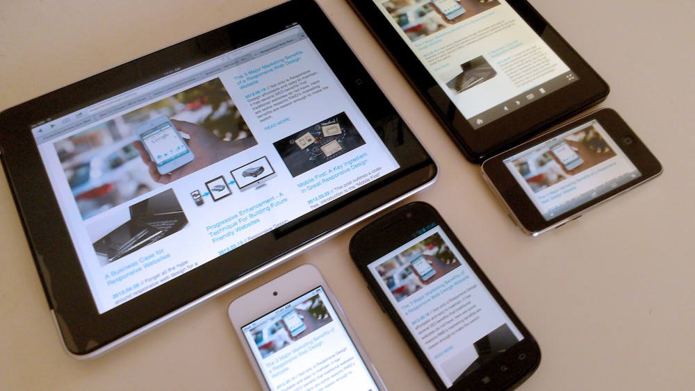
But here’s the problem—while we were busy optimizing for mobile, the landscape kept evolving. We’re no longer just dealing with two device categories (desktop and mobile); we now have smartwatches, tablets, smart TVs, foldable screens, IoT devices, and even VR headsets, all accessing web content differently. And each of these screens demands an experience that isn’t just optimized but genuinely adaptive.
So, is mobile-first already outdated? Absolutely. The new frontier is device-agnostic design, a strategy that ensures websites function seamlessly across all possible devices—including those we haven’t even thought of yet. Companies like Web Design Columbia, based in Columbia, SC, are leading the charge, helping businesses move beyond mobile-first thinking to a more future-proof approach.
The Rise (and Limitations) of Mobile-First
The mobile-first movement didn’t emerge from thin air. In 2016, mobile traffic officially surpassed desktop traffic globally, signaling a significant shift in user behavior. Businesses scrambled to redesign their sites with mobile users in mind, stripping down complex desktop experiences and favoring touch-friendly interfaces.
It was a necessary change, but it also had unintended consequences. Some websites overcorrected, becoming too minimalistic, cutting features that worked well on desktops but were deemed unnecessary for mobile. Others struggled with performance issues, as the responsive design wasn’t always executed properly—leading to bloated, unoptimized sites that looked fine on phones but loaded slowly.
And then came the device explosion. Tablets, hybrid laptops, ultra-wide monitors, foldable phones, and even smart fridges with built-in browsers (yes, that’s a thing) added new levels of complexity. The one-size-fits-all mobile-first approach was no longer enough. In Columbia, SC, businesses noticed their websites weren’t adapting well to different devices. The realization hit: mobile-first was no longer future-proof—it was already outdated.
From Mobile-First to Device-Agnostic: The Next Evolution
Device-agnostic design doesn’t prioritize one type of device over another. It’s about building websites that intelligently adapt to any screen, resolution, and input method. This isn’t just about being responsive; it’s about ensuring a website is equally functional and enjoyable on every possible device.
Consider Apple’s ecosystem. Users might start reading an article on their iPhone, continue on their iPad, and finish on their MacBook. The experience remains seamless, with no awkward layout shifts or missing content. This is what web designers should aim for—fluid, context-aware experiences that don’t force users into a mobile-vs-desktop binary.
Some significant shifts in technology have accelerated this movement:
- Progressive Web Apps (PWAs): These aren’t just mobile-friendly websites—they act like native apps across devices, even working offline. Brands like Starbucks, Twitter, and Pinterest use PWAs to provide seamless, app-like experiences across platforms.
- Variable Fonts: Instead of loading multiple font files for different screen sizes, variable fonts dynamically adjust weight, width, and contrast based on the device, improving both aesthetics and performance.
- Advanced CSS Techniques: Features like container queries (which adjust layouts based on the element’s size, not just the viewport) make adaptive design more precise than ever.
- AI-Driven Personalization: Instead of a static website design, AI can now tailor experiences dynamically, adjusting layouts and content presentation in real time based on the user’s device and behavior.
Businesses looking for website design in Columbia, SC, should focus on these technologies to improve their performance and ensure their websites stay relevant in the coming years.
The Problem with Traditional Responsive Design
At this point, some might argue: “But wait, isn’t this just what responsive design was supposed to do?” Well, not exactly.
For over a decade, Responsive design has been based on breakpoints—predefined screen widths where the layout adjusts. This approach made sense when most users used desktop monitors or smartphones, but it doesn’t work as well in today’s fragmented landscape.
Take foldable phones, for example. They operate in two modes: folded (like a phone) and unfolded (like a small tablet). Traditional breakpoints struggle with this—what happens when a device changes shape mid-use? Do we reload the page? Does the layout glitch? These are real problems developers are now facing.
Instead of thinking in fixed breakpoints, the device-agnostic design focuses on flexible fluid grids, context-aware media queries, and interaction-based UX that adapts in real-time. The goal is to ensure that users don’t just get a resized version of a site but an experience that feels natural on whatever device they’re using.
Big Companies Already Know: The Future Is Agnostic
Major brands have already abandoned the mobile-first mentality in favor of device-agnostic design.
- Netflix: Their UI adapts intelligently across devices, providing seamless transitions between TV, phone, and desktop without a “watered-down” mobile experience.
- Airbnb’s web team builds using flexible, component-based design systems that ensure every interaction works perfectly across screens.
- Microsoft: With products spanning desktops, tablets, and gaming consoles, Microsoft’s web platforms focus on adaptive rather than just responsive design.
Even Google, which once championed mobile-first indexing, is shifting its guidance. Instead of focusing purely on mobile usability, their latest recommendations emphasize overall user experience—regardless of device.
This means a shift in mindset for businesses in Columbia, SC. Website design should no longer ask, “Does this work on mobile?” but rather, “Does this work on everything?”
The Downsides: Why Device-Agnostic Design Isn’t Easy
Of course, device-agnostic design isn’t a magic bullet—it has its challenges.
- Higher Development Complexity: Unlike traditional breakpoints, device-agnostic layouts require more sophisticated CSS and JavaScript techniques, which means longer development times.
- Performance Trade-Offs: Ensuring a consistent experience across devices sometimes requires additional assets and code, which can impact loading speeds if not optimized correctly.
- Testing Becomes More Complex: Instead of testing on desktop and mobile, designers now have to consider a vast range of devices, requiring extensive QA testing across different platforms.
Despite these hurdles, the long-term benefits far outweigh the initial effort. Today, businesses that invest in device-agnostic design will have websites that remain usable, accessible, and engaging for years to come.
The Role of 5G and Edge Computing in Device-Agnostic Web Design
The evolution of internet infrastructure is one of the biggest enablers of device-agnostic web design. While designers and developers have spent years optimizing for slow mobile connections, the rollout of 5G and edge computing is fundamentally changing how we think about website performance and responsiveness.
5G, which has now been deployed in most major cities—including Columbia, SC—promises speeds up to 100 times faster than 4G LTE and significantly lower latency. This means that websites no longer have to be stripped down to their bare minimum to function on a mobile network. Developers can leverage real-time rendering, heavier media content, and richer interactions without compromising load speeds.
But it’s not just about speed—edge computing is equally essential. Instead of relying on centralized cloud data centers (which may be thousands of miles away), edge computing pushes data processing closer to the user. This means that whether someone is browsing on a smartphone, a tablet, or a smart fridge, the website’s assets can be delivered faster and more efficiently.
However, these advancements also create new challenges for website design in Columbia, SC. The traditional “one-size-fits-all” approach to content delivery no longer works. Developers must now consider dynamic content rendering, location-aware caching, and adaptive media loading to exploit 5G and edge networks fully. While this requires a shift in strategy, it also opens up opportunities for hyper-personalized, device-specific web experiences.
Web Accessibility: Why Device-Agnostic Design Must Also Be Inclusive
A website that works across all devices is excellent—but what about one that works for everyone? The push for digital accessibility is growing worldwide, and it plays a crucial role in the future of web design.
Globally, more than 1 billion people live with some form of disability, including visual impairments, motor disabilities, and cognitive limitations. Traditional responsive design often fails to accommodate these users effectively, mainly when focusing solely on mobile-first principles. Instead, device-agnostic design must integrate accessibility from the start, ensuring that users on all types of devices—from screen readers to intelligent assistants—can easily navigate the web.
Major companies have already faced legal action for failing to meet accessibility standards. In 2019, Domino’s Pizza was sued under the Americans with Disabilities Act (ADA) because its website and mobile app were inaccessible to visually impaired users. The Supreme Court ruled in favor of the plaintiff, setting a precedent that businesses cannot ignore accessibility when designing digital platforms.
For businesses investing in website design in Columbia, SC, accessibility must be treated as a core requirement, not an afterthought. This means implementing:
- Semantic HTML for better screen reader support
- Flexible contrast ratios and text resizing options
- Keyboard navigation support for users who cannot use touchscreens or mice
- AI-powered voice navigation for a hands-free experience
The goal of device-agnostic design isn’t just to work on every screen—it’s to work for everyone, regardless of ability.
The Impact of AI and Machine Learning on Website Adaptability
Artificial intelligence (AI) and machine learning (ML) are not just futuristic buzzwords but are actively reshaping how websites function in real-time. Instead of a static design that serves the same layout to every visitor, AI-powered websites can now dynamically adjust content, layout, and interactions based on the user’s device, behavior, and even preferences.
One of the most exciting developments in this space is adaptive UX, where AI learns how users interact with a website and adjusts elements accordingly. For example:
- A website could detect a slow connection and automatically reduce image sizes for a better browsing experience.
- A streaming service might optimize video compression settings based on the device’s screen resolution and processing power.
- An e-commerce site could rearrange its navigation menu based on a user’s browsing habits and past purchases.
Big companies have already started leveraging AI for device-agnostic web experiences. Netflix, for instance, uses AI-driven content recommendations for what to watch and how content is displayed based on the device being used. On a smart TV, you get large, cinematic thumbnails; on mobile, you get a more compact, text-heavy interface.
AI can play a key role in ensuring that business websites feel modern and intuitive across all devices for website design in Columbia, SC. However, some downsides exist: AI-driven personalization can sometimes feel intrusive, and poorly implemented automation can create inconsistent experiences. The key is balancing AI-powered adaptability with human-driven design principles to ensure websites remain functional, accessible, and user-friendly on every device imaginable.
The Future Is Fluid
Mobile-first thinking served us well, but it’s time to evolve. The internet is no longer just desktop or mobile—it’s everywhere. Websites must be prepared for the next generation of devices, whether wearables, AR/VR interfaces, or something else we have yet to invent.
Web Design Columbia is at the forefront of this shift for businesses in Columbia, South Carolina. It ensures that websites work everywhere, not just on mobile. You should rethink your approach if you’re still stuck in mobile-first mode.
Your future customers might not be browsing on a phone or a laptop. They might use a foldable device, a VR headset, or even their car’s infotainment screen. Will your website be ready?
If you’re looking for a website design in Columbia, SC, that anticipates trends rather than just follows them, now’s the time to future-proof your online presence. Contact Web Design Columbia and start building for what’s next.